Cancer Detection with Abnormal Chromosome Levels using Machine Learning

Update March 15, 2022: Summarising the work in an article.
There were over 18 million new cancer cases around the world in 2020, and close to 10 million people died of the desease during the same year. Many cancers can be cured if detected early and treated effectively. Thus, the ability to early detect cancer in the body through a simple blood test has the potential to save millions of lives.
In this article, we will use a publicly available dataset and attempt to improve the results obtained by a research team at Johns Hopkins University. This is the link to their publication.
The approach we will take is as follows; after initial data inspection and split into train and test sets, we will apply data transformation according to the publication before visualising it to verify that the transformation is correct. We then use the entire dataset (no split into train and test sets), apply the transformations before training and evaluating several models. By splitting up the data visualisation and model training steps like this, it will be easier to get a good understanding of how the transformations affect the data.
Furthermore, after correspondence with the research team, we'll train models on both the entire dataset using all the columns, as well as on only the Aneuploidy column.
- Feature set 1: Aneuploidy, Mutation, AFP, CA-125, CA19-9, CEA, HGF, OPN, Prolactin and TIMP-1
- Feature set 2: Aneuploidy
Data Exploration and Cleaning
The data consists of only 1695 samples. 883 of these belong to patients with nonmetastatic cancer (non-null AJCC Stage) while 812 are healthy controls, as displayed below.
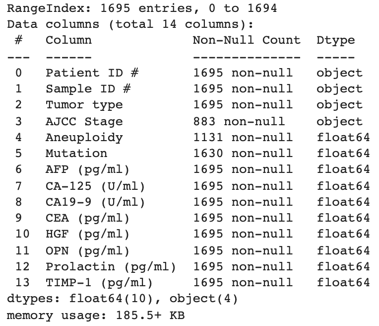
We note that there are 564 NULLs in the Aneuploidy column as well (1695-1131=564).
Another way, perhaps more visually attractive, of displaying missing values is through a plot. This also has the inherit advantage of showing us in which rows the values are missing.
Above plot makes it visually quite clear that there are only missing values in the Aneuploidy and Mutation columns. Some algorithms will have problems dealing with missing values and they will thus be replaced with zeros.
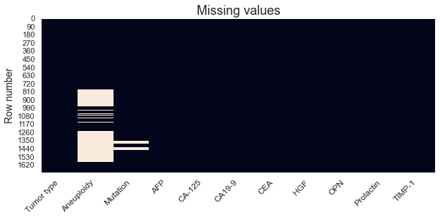
Next, remove the patient and sample ID columns, clean up the column names and convert the tumor type column Tumor type into integer to facilitate further analysis. We'll end up with something like this.
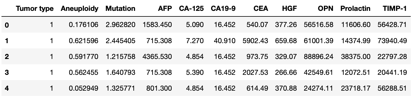
Although we will display the distribution of each column more in detail soon, we can start by calculating some descriptive statistics to get an initial feeling for the data.
Split into train and test sets and apply transformation
The data is split 80:20 into train and test sets while maintaining the same class distribution as in the original dataset.
To account for variations in the lower limits of detection across different experiments, the researchers found the 90th percentile feature value in the healthy training samples. They then found any feature value below that threshold and set all values to the 90th percentile threshold. This transformation was done for all training and testing samples on the Aneuploidy scores, somatic Mutation scores, and protein concentrations.
There are no such default transformation classes in Scikit-learn, and we will thus have to create this logic ourselves as displayed below.
Once we've applied this transformation to both the train and test sets we can move forward by visualising the results.
Visualise the data
Visualise the data before and after applying the transformation to verify that it looks reasonable. In the plot below, the left side displays the original dataset before the transformation while the right side displays the data after applying the transformation. The right side also depicts the difference between the train (light blue) and test (light orange) set splits.
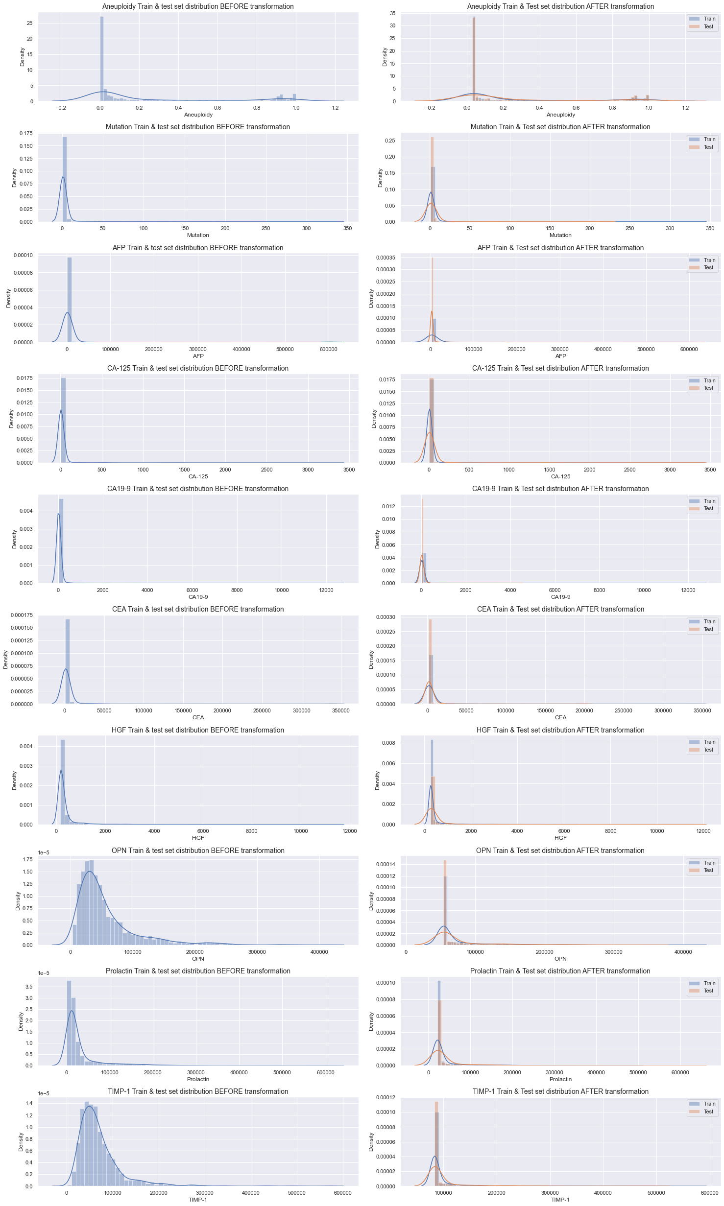
There are significant differences in distribution throughout all variables before and after the transformation. The max values for each variable should be the same on both sides of the plot while the min values on the right should correspond to the 90th percentile on the left. Although it's hard to verify that the min values are exactly right by only visually studying the plot, the overall characteristic of each plot seem to be accurate. Additionally, and as desired, the distributions of the train and test sets after the transformation are very similar as well.
Let's take a closer look at the Tumor type distribution on the train and test sets.
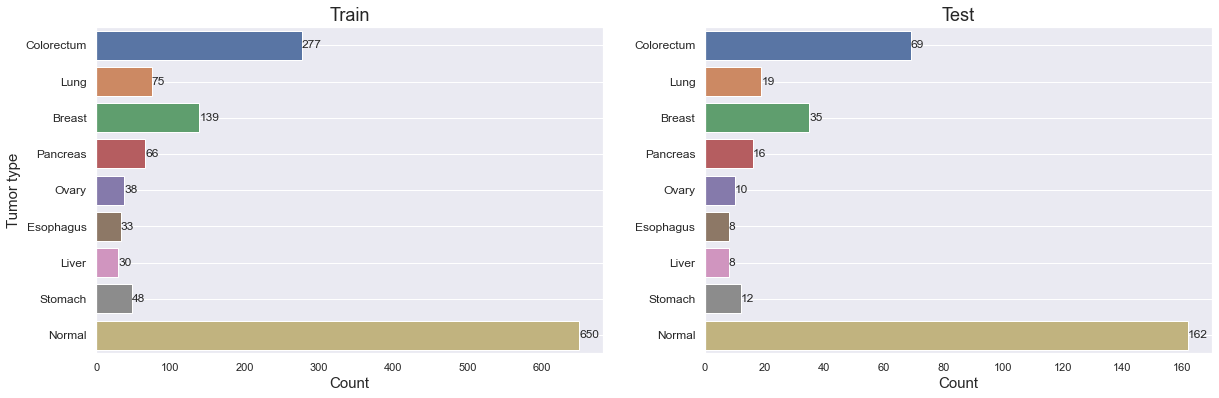
We can verify that the class proportion is roughly the same in both sets. It's also important to note how few samples there are for most tumor types, and in particular for Ovary, Esophagus, Liver and Stomach cancer. It might turn out to be extra difficult to get good results on those.
Plot the distribution for each variable by Tumor type, split by train and test sets, to get a better understanding for how they differ.
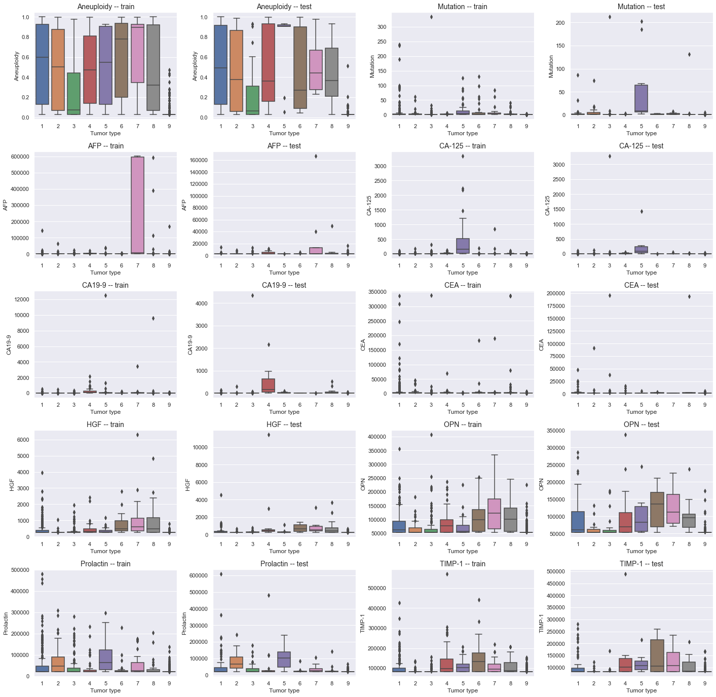
The distribution for almost every single variable is very poor, and there are very small differences between each tumor type. Aneuploidy, OPN and perhaps Prolactin and TIMP-1 seem to differ slightly more between the different tumor types though. Additionally, Aneuploidy seem in general to have higher values for cancerous (1-8) than for healthy (9) samples, and will likely play an important role in classifying between the two. The distribution for the train and test splits are fairly similar.
It's already quite clear that none of the distributions are normally distributed. To verify this statistically, we can conduct a normal test.
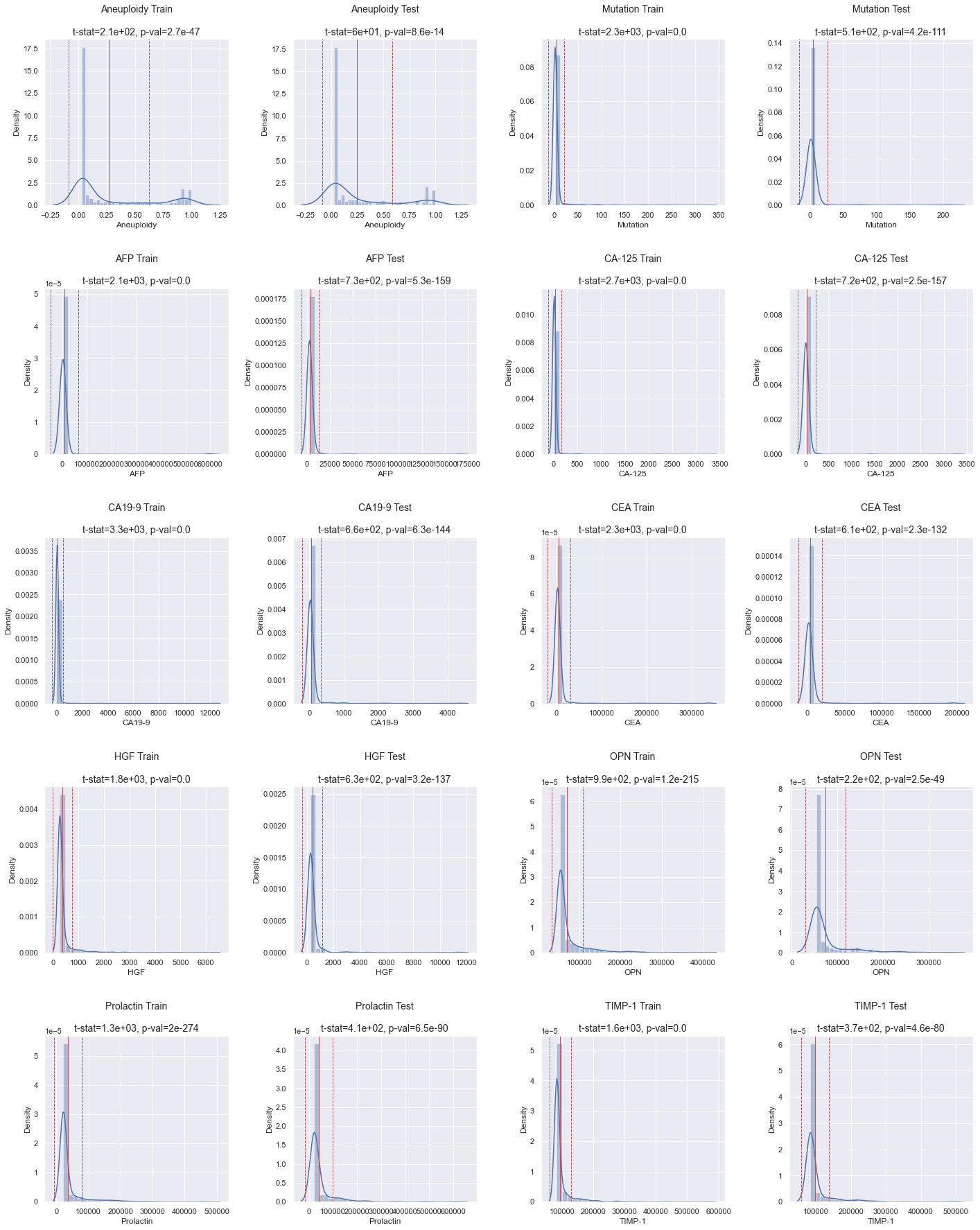
As indicated by the p-values in the histograms above (see the title for each individual plot), none of the distributions are normal.
Next, calculate Pearson correlation coefficient between each variable in the dataset and display it in a correlation matrix. This will help us understand what features might affect the target variable Tumor type the most.
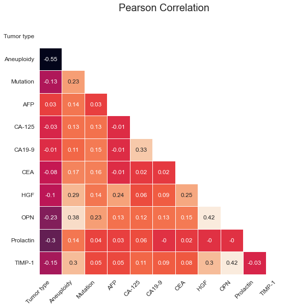
There's a pretty strong negative correlation (-0.55) for Aneuploidy with Tumor type, which is in line with our observations from the tumor type distribution plot earlier. Prolactin and OPN also display relatively strong negative correlations. Although CA19-9, CA-125 and AFP display very low correlation individually, they might play a more important role in pair with other features. Since there is no collinearity beween the features and as we prefer to automate feature selection at a later stage (if applicable), we won't do more at this stage.
Machine Learning Modelling
We'll go with 10-fold cross-validation to properly evaluate model performance on the relatively small dataset. To incorporate the transformation logic while performing 10-fold cross-validation, model tuning and model evaluation, we will make use of pipelines. For visualisation purposes, the transformation steps were covered earlier in the notebook, but in order to run unbiased cross-validation, those steps have to be executed concurrently in each fold during cross-validation.
We will evaluate both individual and combined models (also referred to as ensemble models). The individual models are Logistic Regression, KNN, SVC, Random Forest, Gradient Boosting, CatBoost, LightGBM and XGBoost. Additionally, by combining several models into one using stacking or voting techniques, we can use the strength of each individual model to create an even more powerful model.
Scikit-learn makes this pretty easy by providing us with two classes; StackingClassifier and VotingClassifier. StackingClassifier consist in taking the output of individual models and use a final classifer to compute the prediction, while the VotingClassifier determine the final prediction by voting among the individual models.
The pipeline, which also includes a StandardScaler, and cross validation function for evaluating the models looks like this:
And the code for training and evaluating individual models:
And this is how the ensemble models are evaluated. Although only the StackingClassifier is shown below, the code is very similar for both types of ensemble models.
Train and Test Models using All Features
Individual Models
Training and evaluating the individual models on all features yields the following results:
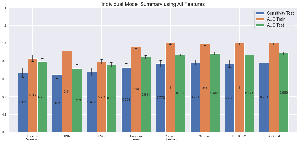
We note that the more powerful models, Gradient Boosting, CatBoost, LightGBM and XGBoost overfit on the train set with an AUC of 1.0 while still performing better on the test set compared to the other models. Most performant are XGBoost (1.0 AUC on the train set and 0.89 on the test set) and CatBoost (0.99 AUC on the train set and 0.88 on the test set) though.
Ensemble Models
All models will be used in the VotingClassifier ensemble while we will exclude Random Forest and SVC in the StackingClassifier models. These are excluded because they were similar to one or several of the other models without being better on any single metric (I have not included all the plots in the article to verify this). Since the general idea with ensemble models is to leverage each individual model's strength, the individual models without any strenghts relative the other models will be excluded. Some other ensemble model characteristics we choose are:
For the voting classifiers
- We will use voting='soft' as it is the recommended approach for well-calibrated classifers (which these are since we've done hyperparameter tuning).
- Use weights=[1, 3, 1, 4, 2, 4, 4, 3] to give more weight to more performant and unique models (higher means more weight) such as Random Forest, CatBoost and LightGBM.
The stacking classifiers will all use passthrough=True to make sure that the final estimator is trained on each individual model's predictions as well as on the original training data. Additionally, the final estimator will differ between the different ensembles as follows:
- Stacking Classifier 1: Logistic Regression
- Stacking Classifier 2: Random Forest
- Stacking Classifier 3: Tuned XGBoost
- Stacking Classifier 4: Default XGBoost
- Stacking Classifier 5: Tuned CatBoost
There are many more combinations and characteristics that can, and should, be evaluated. However, this is a very time consuming task, with limited upsides, and we will thus not spend more time on that here. Below are the results after training and evaluating the ensemble models.
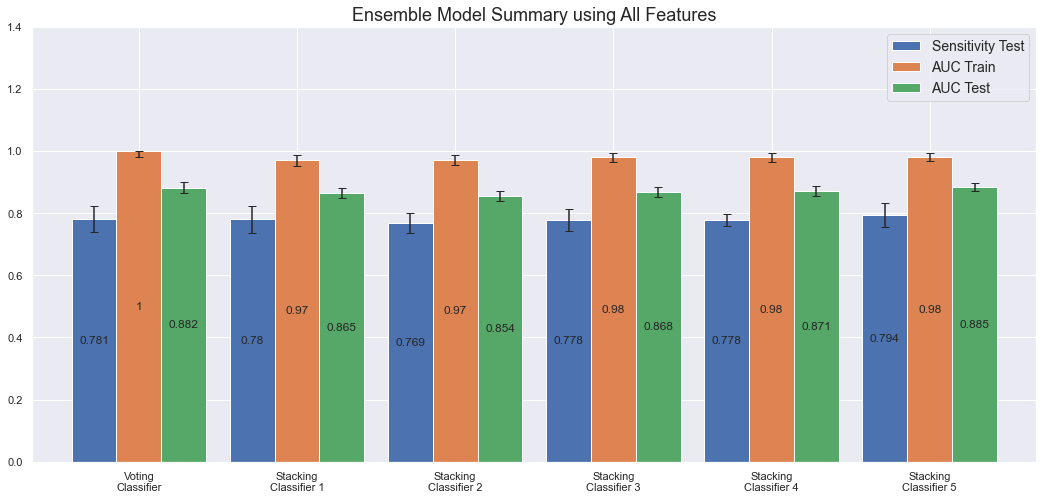
The most performant ensemble model is the Voting Classifier (1.0 AUC on the train set and 0.88 on test set) along with Stacking Classifier 5 (0.98 AUC on the train set and 0.89 on the test set). The disadvantage with these ensemble models though, a part from taking very long time to train, is that there is currently no good way to properly understand how they make their predictions. For the individual models it's possible to calculate feature importance or SHAP values, but the ensemble models are, as it's commonly referred to, still black boxes.
Model Explanation - Confusion Matrix & Sensitivity
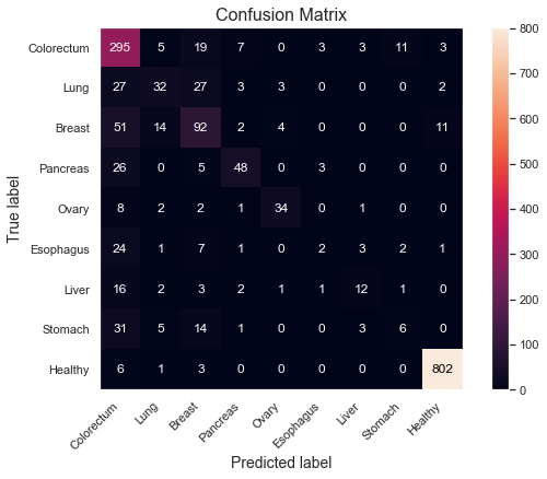
Let's take a deeper look at the strengths and weaknesses of the models in terms of which classes they perform best on. We can do that using a confusion matrix and a bar plot for the sensitivities, split by Tumor type. For brevity, focus only on the most performant XGBoost model.
- Specificity: 99%
- Sensitivity: 98.1%
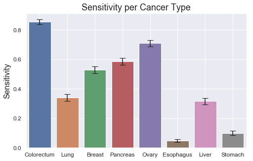
The model does very well on distinguishing cancer from healthy samples; 802 out of the 812 healthy samples are correctly classified as healthy, corresponding to a specificity of 99%. Correspondingly, 866 out of 883 cancer samples are correctly classified as cancer, yielding a sensitivity of 98.1%.
However, there are more difficulties determining which cancer type it is, as displayed in the sensitivity plot. Colorectum and Ovary score quite high at around 85% and 70% respectively, but half of the sensitivities are 35% or lower. There also seem to be some relationship between the low class count and poor performance on some of the tumor types, such as Esophagus, Liver and Stomach, which all have 60 or less total samples in the dataset. By having fewer examples for the model to learn from, it's reasonable to assume that the performance could degrade. Ovary seem to be the only exception with relatively high scores despite low class count (48). Slighly more beneficial distributions, as observed in previous box plot (see class 5), might explain this.
Model Explanation - SHAP
Let's calculate SHAP values for the most performant individual models to get some insights into what features are most important.
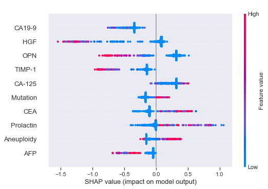
The way we can interpret the SHAP values for the XGBoost model is as follows (covering some example features). Have in mind that the lower Tumor type classes 1-8 are cancerous tumors while the highest class 9 is a healthy control group.
- Higher values (red) of HGF leads to an increased probability for cancer (lower class numbers).
- Higher values of OPN leads to an increased probability for cancer.
- Higher values of TIMP-1 leads to an increased probability for cancer.
- Lower values of CEA leads to an increased probability for cancer.
- Higher values of Prolactin leads to a decreased probability for cancer.
- Although the distribution is quite mixed for Aneuploidy, in general higher values leads to a decreased probability for cancer.
According to the publication, 49% of the 883 cancer samples had detectable Aneuploidy levels. This might explain our mixed observations above.
We can make corresponding observations for CatBoost. We make roughly the same conclusions for both models.
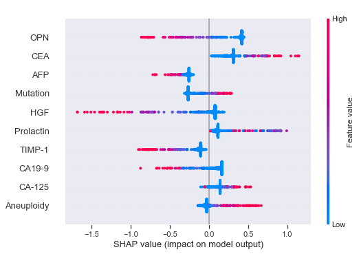
- Higher values of HGF leads to an increased probability for cancer.
- Higher values of OPN leads to an increased probability for cancer.
- Higher values of CEA leads to a decreased probability for cancer.
- Higher values of Aneuploidy leads to a decreased probability for cancer.
Train and Test Models using only the Aneuploidy Feature
Individual Models
As explained in the beginning, after a dialogue with the research team, I was asked to also assess the model performance using the Aneuploidy feature only. Doing so, yields the following results.
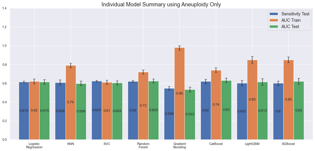
By feeding the model 1/10th of the feature set, and thus less information to learn from, we would expect the results to be worse than before. Above plot confirms this. Both sensitivity and AUC on the test set is more or less the same for all models, except of Gradient Boosting which seem to overfit significantly. By only using the Aneuploidy feature, the model seem to have harder to distinguish between the different tumor types. Still, the predictions are pretty good for only including one feature as input.
Ensemble Models
The following models are included in the ensembles; KNN, Gradient Boosting, CatBoost, LightGBM and XGBoost, which is one less (Logistic Regression) than when we used the entire dataset.
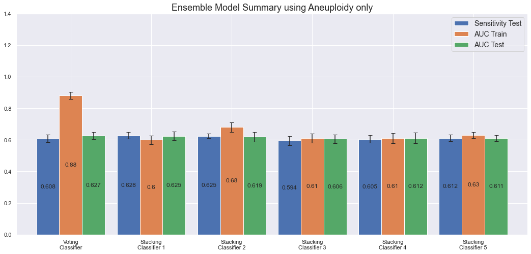
We note that all ensemble models have more or less the same AUC and sensitivity on the test set; around 60%. Only the VotingClassifier overfits the data.
Model Explanation - Confusion Matrix & Sensitivity
Let's plot confusion matrix and sensitivities for the most performant model. There's very little difference between each model, but let's go with the CatBoost as it's the most performant individual model while still performing in par with the more complex Stacking Classifier 1.
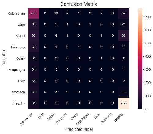
- Specificity: 94.6%
- Sensitivity: 77.6%
The model is able to distinguish 768 out of 812 healthy samples, yielding a specificity of 94.6%. Sensitivity is at 77.6% as it correctly classifies 685 out of 883 cancer samples.
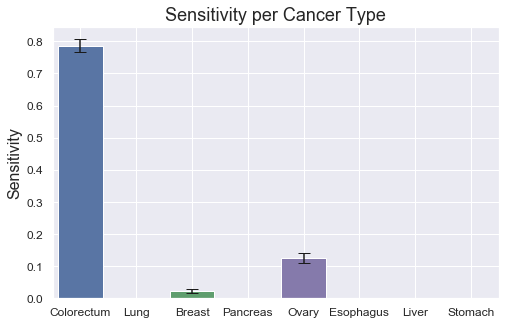
The individual sensitivies per tumor type are very weak though with only Colorectum scoring fairly well. All other tumor types score very low. It thus seem like as if Aneuploidy can be used to distinguish cancer from non-cancer samples fairly well, but it falls short when determining which cancer type it is.
Model Explanation - SHAP
Let's also briefly also calculate the SHAP values. Obviously, since we only have one column to work with - Aneuploidy - only that column will affect the predictions. Let's see if we can confirm the observations from when we used the entire feature set though. Display only SHAP values for the CatBoost model.
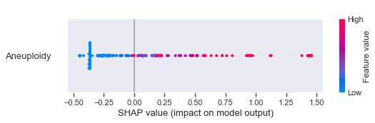
As identified before, higher values of Aneuploidy seem to decrease the probability for cancer.
Conclusions
We have trained and evaluated several different machine learning models to determine whether a sample is cancerous or healthy. After correspondence with the research team, two set of features have been evaluated as specified below.
- Feature set 1: Aneuploidy, Mutation, AFP, CA-125, CA19-9, CEA, HGF, OPN, Prolactin and TIMP-1
- Feature set 2: Aneuploidy
By using the entire feature set (Feature Set 1) the results are significantly better than when only the single Aneuploidy feature is used. This is reasonable as we would expect more data and input for the model to base its predictions on to also yield a more performant model.
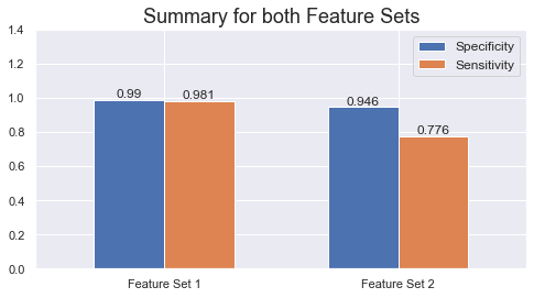
With Feature Set 1, we correctly classify 98.1% of the cancer samples (sensitivity = 98.1%) while 99% of the healthy samples are correctly classified (specificity = 99%). Corresponding sensitivity and specificity is 77.6% and 94.6%, respectively, when using Aneuploidy only. That's still pretty good for only using one feature.
This is a significant improvement compared with the publication that used a Random Forest model to get 75% sensitivity at 99% specificity (our Random Forest would have had roughly the same performance had it been optimized for specificity rather than AUC). The main difference in this implementation has been to evaluate additional models, where XGBoost turned out to be the most performant.